Wednesday, May 7, 2008

I can’t go on. I’ll go on.

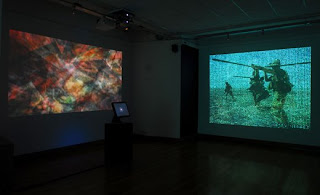
I can’t go on. I’ll go on is on online exhibit from Samuel Beckett’s novel Molloy. It is an interactive piece that consists of two parts. The first is a blog portion where viewers are encouraged to leave their thoughts and comments. The second portion is a multimedia presentation that is triggered by comments left on the blog. Each comment changes the multimedia display based on the keyword entered. Appropriate excerpts accompany the deconstructed keyword that goes under the video.

Most of the videos are also deconstructed. The entire picture is not shown, but rather only certain portions. Beckett’s writing accompanies the videos as well. The text is dark and foreboding. I attempted to add a trigger word in the blog portion, but could not get the software to add my words. I do not know if there is a glitch in the system or if I was not doing it properly. Despite this, I was able to watch the streaming video with the comments of those that had visited the site prior to me.

One video seemed to be about death and accepting one’s destiny. The sound effects that go with the videos and text are on a continuous loop and do not change depending on content. The exhibit is cool and I enjoyed the interactive portions the best. I would probably have enjoyed it more if I could have left comments, but never the less it was still interesting. I really enjoyed how the deconstructed words scrolled on to the page slowly. The entire mood of the piece was vey mysterious and I think this definitely enhanced that feeling.


Why Some Dolls are Bad


I found this exhibit on Furtherfield.org. Why Some Dolls are Bad is a graphic novel that has been generated on a Facebook platform. Internet artist, Kate Armstrong, arranges a stream of images off of Flickr. Armstrong then attaches each with a certain tag as well as her own original text. This produces an ever-changing dialogue. Users who subscribe to Facebook can order the pictures. It is then up to each individual whether they want to reorder the sequence, delete certain pictures, save them or send them to a friend. As a result, every story is going to differ from the next. Dolls explores themes of fashion, ethics, “artifice and the self”. The novel also reexamines government systems as well as materials like mohair and household plants.

Originally, I do not find the individual images to be interesting. They seem like thoughtless snapshots that did not even make the cut to be in the family album. I suppose with the text, the pictures become a bit more inviting, but for me the whole project falls a little short. Despite this, I do think the concept is an interesting one. I think the execution left a bit to be desired. I would of liked to see more interesting photos with a much more provocative dialogue. I think this could really stir up some interesting conversations between the members of Facebook. I do enjoy the comic book look of the inserted text boxes. Unfortunately, the actual text just seems like an afterthought. All this being said, I think Armstrong was trying to keep the exhibit light and fun. The images paired with the text are meant to amuse the viewer. 

Saturday, May 3, 2008

Transformer Gallery

I just went to the Transformer Gallery on P Street in Washington DC. It is a small gallery with only one floor for the art to hang on. The exhibit that on display now is Hatnim Lee’s Photographs. The exhibit runs until April 26th. The content is everyday life. The pictures do not seem staged although I am sure some of them required a bit of direction. They are all portraits. When I say portraits, I do not mean the normal straight forward shot. Lee definetly seems to capture the essence of each subject through different ways. The background gives a depth to the characters in each photograph. The images are large-scale prints. The content ranges from intimate portraits to fashion shoots. The images have an innocence that connects with the viewer. Lee utilizes short depth of field balanced with a good use of negative space. She definitely breaks the picture plane into thirds, which in turn draws the viewer’s eye around the entire image. The images are C-prints, which really make the saturated, bold colors within each scene pop.

This exhibit is a diary of Lee's life over the past year. She has photographed her every day activities. These include subjects from her freelance jobs at National Geographic to employees working in her parents store. One of my favorite pictures the one of an androgynous model. The mood in the photograph is dark and intimate. Lee seems to have a talent for capturing these real-life moments and showing them in an appealing way. One really feels that you have some knowledge of each subject, simply because of the way they are posed and the background information.

Lee has been writing a blog over the past year that includes these photographs and many more. A book is being compiled of all of these pictures in order to document their stories.

Here is a link to her blog

Tuesday, April 29, 2008

MANIFEST ORDER


At Hemphill Gallery on 14th Street NW in Washington DC, Franz Jantzen’s Manifest Order is on display. All the works are cartographic assemblages. The images are printed using archival pigments. They are then mounted on aluminum sheets. Jantzen uses a digital camera to document a single plane from a constantly changing vantage point. The resulting images are assembled using hundreds of photographs in Photoshop. The final product is an inventive interpretation of the original location. Jantzen turned, twisted and pixilated certain elements within the each final piece, which creates an intricate maze of exploration for the viewer.

Jantzen has documented many historical sites such as the Uline Arena ceiling in Washington, DC and McSorley’s Bar in New York City. The images themselves are printed in large scale. The photographs range in size from 17” x 20” to an impressive 41” x 176”. They are all black and white, yet they are vibrant and saturated in deep blacks, crisp whites and a pleasing range of gray tones. Jantzen demonstrates a good use of negative space. In some images, he tempts the viewer with details and then fades out the necessary elements. It is a very interesting exhibit, so check it out if you get the chance.

Hemphill Gallery 1515 14th Street NW Washington, DC 20005

Thursday, April 24, 2008

“ If it makes you laugh, if it makes you cry, if it rips your heart out, that’s a good picture.”


Those were the words of the legendary Eddie Adams. He is just one of the Pulitzer Prize Photographers highlighted in the exhibit at the Newseum in Washington DC.

In the Newseum’s Pulitzer Prize Photographs Gallery, I was very moved by the world’s greatest news photographs. There were six floors of exhibits, but I am going to focus on the Pulitzer Prize Photograph exhibit. Every Pulitzer winning photo was represented since 1942 to the present. The exhibit was unsettling at times, with graphic images of the world’s history. More than once, I got chills staring at the images of war, famine and natural disasters. True to the human spirit, there were many photos that made me feel hope and some that even made me smile.

A very nice thing about this exhibit was it was very interactive. There was a movie in the center of the photographs that ran on a continuous twenty-minute loop. It highlighted a number of the photographers that had won Pulitzers. It was really fascinating to see the images that came before and after the “money shot.” I particularly enjoyed being able to hear the stories of the events unfolding around these journalists during the different situations they were asked to cover.

Many of the photographers were still visibly distraught concerning the different stories they had been asked to document for the world. There was an image from a mudslide in Armero, Columbia that Carol Guzy and Michel DuCille captured. She explained how the woman, who had been trapped in water for 72 hours, was talking and reaching out to the people who were attempting to get free her. Even though so many were trying to help, she ended up drowning because there was no way to release her from whatever was trapping her underneath the muddy water. Guzy expressed her disbelief that it was not possible to save this innocent woman. The picture that won the Pulitzer was the last shot before she went under. Guzy made it clear you cannot go out searching for a Pulitzer; you just have to be there for that moment between life and death. You just have to get that shot. The shot that makes you question whether you should of helped instead of staying behind the lens. The shot that wakes you up in the middle of the night asking why things couldn’t of happened differently. The images are haunting in a way that video is not. The still image is so powerful. In just one photograph a story is told to the entire world. These images have helped shape history. I can only imagine how hard it must be to strike a balance between doing your job and acting like a human being. 


Wednesday, April 23, 2008

Dreams


I went and saw an amazing exhibit at the Hirshhorn Museum. It is called The Cinema Effect: Dreams. Twenty-one different artists contributed to the collection. In Dreams, the artists use the digital technology and techniques of the cinema to create an almost hallucinogenic experience. I was transported into their worlds where anything goes…

Each artist had a different approach to his or her work, yet the major emphasis for all of them were consistent. To me, each piece focused on crossing into a dreamlike state of mind. Reality is definitely questioned. This was apparent from the start of the exhibit. I entered through a plastic sheet hung from the ceiling into a room shrouded in complete darkness. I accidentally bumped into a stranger that seemed just as confused as I was. As we exchanged apologies, I noticed a small arrow illuminated on to the floor. The arrow led me into many more dark rooms filled with whimsical and scary pieces of art. I felt as if all my sensibilities were taken away at the door and this made it very easy to focus on each piece. It was a three-dimensional full-body experience.

There are too many pieces to mention them all, so I will only give you the highlight of my trip. In one giant pitch-black room, I found Anthony McCall's You and I, Horizontal. This piece consisted of a projector giving off a large circle of light. The way one must enter the exhibit, the light is shining directly towards you. This definitely throws of your depth perception of how to get through the room and what exactly this beam of light is supposed to be doing. After allowing my eyes to adjust, I realized the beam was creating a half circle on the opposite wall. I actually walked into the middle of the projected light and it was like sensory overload. I honestly felt like I could have been on drugs or something. It was so fantastic to look into the light…there were cloudy rings that were moving all throughout the light. It was not smoky in the room, so I have no idea how this effect was created, but I definitely enjoyed it. This piece was very simple when it came to the elements required to create the actual finished product, but the mood that was produced as a result was intense. I felt as if I had been transported back into my childhood while being trapped between a state of consciousness and sleep. It was a very interesting and bizarre experience.

If you get a chance, check this exhibit out. Dreams runs until May 11, 2008. It really is an extraordinary experience.


Tuesday, April 8, 2008

UNCOVERED...


I am reviewing Uncovered by Thomas Allen. It is a book of photography that I came across on the Internet. It is very interesting work. His work is very unconventional. He takes figures from the covers of old pulp paperbacks, cuts them out and then creates a scene around them. The figures take on a three-dimensional look when placed into the wonderful moments created by Allen. 

The photos have a vintage feel, like something out of the 1950s or 60s. The images are kitschy, and some remind me of old pin-up girls and comic book pictures.Allen combines the figures with interesting everyday objects. His lighting in each scene is impeccable, making the flat figures appear to be coming to life. His use of shadows only increases the believability that these figures are not flat. 
Most of his photographs utilize shallow depth of field which works to his advantage. The scenes he creates are not to be taken too seriously. They are light-hearted and witty. 
Allen is inspired by a long affair with pop-up books and a fascination with the View-Master Stereoscopic toy from his youth. The scenes he creates are generally muted colors with the figures being the main pop of bright color. This definitely draws your eye immediately to the focal point of each piece. 
Overall, I very much enjoyed looking at Thomas Allen's work. I find it refreshing and innovative. Its always fun to create something new out of something old.

Wednesday, March 5, 2008

Addressable Memory


Addressable Memory, by Michael Takeo Magruder, is an exhibit portraying the landscape of the digital world using it’s own instruments. Magruder installation deals with the mash-up and composing of video feeds, mobile phones, video screens, news feeds, computer image processing and virtual reality. He blows up the images until they are pigmented and pixilated in order to really examine our connection and dependence on these tools.

The project consists of three rooms. The first room has large-scale prints and projections of pixilated video and camera phone images. Words are blown out and the images are severely abstracted. The color is divided into grids. Even the placards are made from small video screens. This is a nice effect. The images themselves are quite pleasing. Some are still recognizable, yet others have taken on a completely different persona.

The middle room has generative art prints that are created by software that produces compositions from “reprocessed digital imagery.” This room represents the meshing of sound and image, a “microcosm of both social and media networks.”

The third room is only lit by projections and screens that remix the audio and visual imagery that represent the mass media. The media “re-maps” the facts accordingly, and in this piece Magruder turns the attention back onto the media. Addressable Memory is an interesting look into how the average person relies on digital technology. It is rare that you will find someone that does not own or use a cell phone, computer or other digitally based technology daily.

In many ways, these devices keep us connected; yet Magruder exposes the disconnections that make up these forms of communication. Addressable Memory “re-presents the representations of the personal and institutional products of this machinery in a more contemplative and more contextualizing way, intensifying the use of technology to the point where the presence of that of that pervasive technology is again visible but the content and operation of that technology is defamiliarised and contemplatable.”

too bad he got reelected...

Check out the journey...

video.html

I am reviewing the Bikes against Bush Campaign that occurred live, during the Republican National Convention, in NYC during 2004. The protest was interactive. The participants used wireless Internet enabled bicycles that were rigged with custom-printing devices. The messages were printed with water-soluble chalk on the sidewalks of the city as the volunteers rode their bicycles. The chalk naturally  away within fifteen days, so it should not be considered graffiti. The text messages came in live, via the net, and each rider had the final choice of what which would be used in the project. No profanity or obscene language was used in any of these. There was only one “printing” bike, but other cyclists rode in support.

Apparently the creator/activist, Joshua Kinberg, was under surveillance during the protest. He was later charged and spent five months in court. The case was eventually dismissed around the time that George W. Bush was being inaugurated for his second term. It was a bittersweet victory for Kinberg.

I think this is a very provocative way to protest one’s political views. Since the messages were printed all over the sidewalks, it is inevitable that thousands of people will read them on their respective journeys. The messages plant the seed that get the average joe thinking about the issues important in any upcoming election. Hopefully, this will stem valuable conversations and debates between people from all parties. This was a very socially conscious protest aimed at encouraging people to look into the reasons why Bush is not fit to run this country. I bet it was a lot of fun to do too.

Tuesday, March 4, 2008

DISTANCE by Tina LaPorta


I am writing about an online art experience I found on turbulence.org.

It was called Distance: Disconnecting…

The series consisted of snapshots of the Tina La Porta's online communication. Text accompanied the images leading the viewer on a voyeuristic journey of the exploration of communication. This piece was interesting to me because we are doing a project in class that deals with the same topic. While the artist’s images seemed a bit outdated and uninviting, I think the concept works. The work investigates the “disembodied and dislocated nature of on-line communication”. To me, the disconnect between technology and people is getting wider every day. While the Internet is very instrumental in bringing people together, this work shows the loneliness one can feel when “connected”. Because the Internet is so readily available to most people, the opportunity to connect with others all over the world is virtually endless. When one is chatting online with another you are completely dependant on the other’s response for gratification. If they sign off before you are finished expressing yourself, you might feel a bit disappointed. There is also a sense of anonymity when on is communicating via the net. In some cases, individuals are only identifiable by codenames, outdated photos and so forth. La Porta distorts and pixilated some of her images to express this “disconnected” feeling. 

The online piece required the viewer to click through all the images. I think the artist utilized this instead of a streaming video in order to drive home the meaning behind the entire experience. I felt slightly disconnected from the entire piece. The images made me feel as I was a voyeur. This is a nice effect that La Porta captured through her work. 

Tuesday, February 26, 2008

Simon Kavanagh


Simon Kavanagh’s snapshots of photos from his extensive travels are a wonderful group of work. He does not let on to which country any of them are from, but invites you to see if you can guess. He utilizes both a manual and digital camera for these pictures. No image is enhanced or altered from the original. The photos represent architecture, signs and people that inspired him along the way.  

I appreciate the wide range of content in this series. Kavanagh also takes advantage of different elements of the camera and film to compose his perfect snapshot. The use of slow shutter speed to accentuate the city lights at night is very effective. As a photographer, living in DC, I did an entire dedicated the magical quality these lights take on when blurred and splashed across the film. They truly do seem to vibrate like musical notes. 

Kavanagh’s perspective is quite interesting. He continually crops out elements leading one to focus on only what he saw. One picture is even taken from an upside down perspective. All of the pictures capture a mood. He achieves this through his use of available light, film choice, angle, depth of field or time of day. Even the blurry images convey a sense of urgency. The images, as a whole, were a delight to view.

 The images can be seen at:

http://www.mediartists.net/

Joseph Joy


I am reviewing Joseph Joy’s Paintings. His style has a pop art feel. His paintings seem to comment on the important issues within our culture. The work touches on sex, politics, pornography and fast food just to name a few. His seems to interpret his own experience involving these subjects into his work.

The paintings themselves are simple and straightforward in their content. In most of his work he uses vibrant and muted colors in contrast. The subjects are not very detailed. His line detail is minimal. The color has more impact. His work has a cartoon feel to it.

A few of his pieces deal with homosexual/transgender content. He has a painting of a woman in a pool that could be interpreted to have a male profile. Another one of his paintings reads, “God Said Kill Fags”. I interpret this as a stab at the religious right that believes homosexuality is a sin. I think this is an absurd statement. Joseph Joy could have been expressing his own disgust at this by painting this extreme statement.

I enjoyed his paintings because although they are simple, the content invites one in to dig for the deeper meaning behind each piece. America is overwhelmed with fast food, over consumption, politics and sex. It is always enjoyable to see art that comments on relevant issues.

*these paintings can be found at:

 http://www.furtherfield.org/jjoy/caribbean_sunshine/index.htm

Monday, February 11, 2008

Interview with Charles Cohen


This interview discusses Charles Cohen's Buff series. In this series he utilizes the cutout effect. Cohen explains that the viewing experience is divided into three effects. The first is the initial recognition of the cutout.  The viewer notices the void straight away.  The second effect is the abstract effect. He explains this as any intellectual activity that the viewer goes through after noticing the void of the cutout.  The abstract effect is the time when the viewer is deciding how to comprehend each picture. This is the time where one might recognize what the cutout was before it was removed. The results might vary depending on who is actually deciphering the piece. 

In the Buff series, some viewers assume the images are pornographic.  Despite the fact, that it is unclear whether the cutout parts are clothed or nude.  The title of the series suggests that they are nude, but it is obvious that Cohen is interested in pushing the question: What is pornography?

Is it created in our minds or is it a tangible issue. I believe it is formed within our minds. Society instructs us to what is acceptable and what is not, but how is this determined? Who is the authority on the manner? What makes one person uncomfortable is not necessarily offensive to the next. Pornography is a booming business, so why are people reluctant to admit they buy it?

In the Buff series, the pornographic element is created within the subconscious of the each viewer. This conclusion sets up the third element of the viewing experience, which is the reflexive effect. During this stage, the viewer combines all viewing modes and constructs the meaning of the entire experience.

This is when one might “assume co-authorship with the artist.” Cohen's theme revolves around the absence of presence. His work encourages people to explore bigger issues than the actual cutouts. Without this exploration, the series would not be so interesting. It is effective because the shapes are recognizable to every viewer. The final reflexive effect will vary depending on each participant.

*This information was taken from an interview between Mark Cooley and Charles Cohen on September 28, 2006

Wednesday, January 30, 2008

Tagged in Motion


I am reviewing Tagged in Motion(watchfor my first blog entry.  The project combines the two-dimensional art of graffiti with a 3-dimensional virtual depiction.  The video shows graffiti artist, DAIM, creating a piece in the middle of a large warehouse.  His strokes are being tracked by three different cameras strategically placed around him.   DAIM is able to switch colors, textures and size of any stroke through a Bluetooth controller.  He can see his work, in real-time, through a head mounted display.  Upon conclusion, the final image is shown on the video in all of it's 3-dimensional glory.  

Traditionally, graffiti is found anywhere an artist can navigate their spray cans onto, into or up to. Just to name a few reoccurring haunts, there is the always classic, subway, street signs, billboards and tunnels. There is always exceptional depth within the pieces even though they are created on flat surfaces. Depending on the the artist, a viewer might have to spend a little extra time deciphering the message within each piece.  This definitely adds to the mystique surrounding the graffiti scene.  Many times, artists will have numerous pieces up all over their city and sometimes the world, yet there identity is limited to their tagging name. This anonymity is crucial when throwing up pieces in public places. Having the ability to create these pieces in 3D opens a lot of doors, all the while keeping artists out of the back of squad cars. The final 3D pieces also have the potential to be way bigger and more intricate using this new technology. There really are no boundaries.

That being said I do not think this form of graffiti will ever catch on within the scene. Furthermore, I do not think it should.  Maybe I'm old-school, but I want to see these pieces when I'm in any city. I enjoy being amazed when I notice art in places I cannot fathom anyone getting to.  3-dimensional pieces take all of this away. To me, this is an essential part of the graffiti scene. Something that should not be left out in the cold.  While the video was interesting, I see it more as novelty than an art from that will make a lasting impact within the graffiti world. 

*Project was found off Networked Performance website